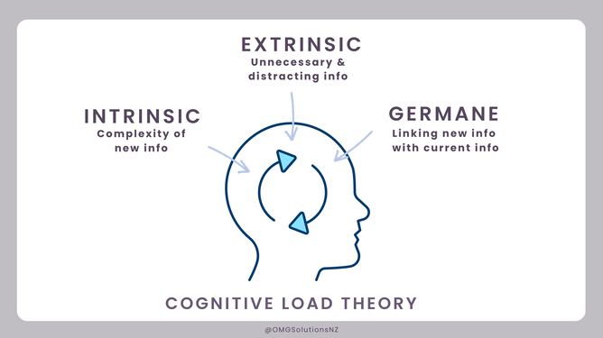
Cognitive Load Theory is essentially the brainpower people need to process information. There are three aspects to consider:
The first is intrinsic cognitive load, or the content itself, like the words in This sentence.
The next is extraneous cognitive load, or the unnecessary additions that distract from the central message and don't relate to what you're trying to convey. Like flashing text.
Finally, there’s Germane load. This refers to additions, that unlike extraneous cognitive load, help the message come across clearly to the user. Like making important words a different colour or making them bold. Lists and headings are great because users will skim read content to find what they need.
Cognitive Load Theory is a masterful advantage within a marketer's toolkit.
We always want to focus on showing information relevant to the user that requires the least amount of brain power needed for them to be able to then go on and make the next choice they need in their journey, to ultimately purchase.
The use of filters and categories, search functions, save info, and sort functions all help in this instance.
Example of visual hierarchy to support cognitive load
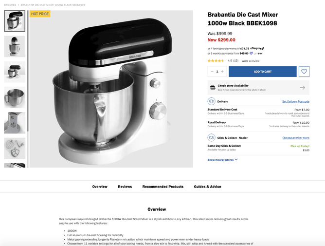
In an e-commerce store consider the visual hierarchy - you’d normally have a hero image, with a group of similar product images, followed by the main points perhaps in bullet points of the product, then a description, further down you’d expect reviews and then similar products you might like. Pricing information invites you add to the Cart, and the shipping information is very visible ensuring the user knows the information needed to make take their next step.
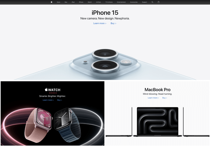
Grouping content and structure
For most websites content is grouped in stacks, often differentiated by colour and images/video. You’ll have a larger heading, followed by a sub header, perhaps a short piece of content then the imagery and call to action to draw the user to the next part of their journey.
This structure helps our brain to figure out what information is related to what and what to do next.
This example uses colour to break up stacks – you can see the search function at the top and call to actions within each stack.
To learn more about website design and layout using the eight principles proposed by Information Architect Designer Dan Brown in 2010 click here.