In web speak we say a user converts when they take an action on a website that we want them to take.
For example, a newsletter signup, email enquiry, for an e-commerce site a user clicks the buy button, or even just clicking through to the next page on the website.
A conversion rate is the totally number of visitors to a webpage that convert. For example, if 100 users visit a page and two actually click "buy", then the conversion rate is 2 percent.
Conversion rate optimisation is an ongoing practice, because unless you have 100 percent of visitors taking the action you want on your website it can always be optimised further.
Conversion rate is also impacted by page design – the layout of text and images on the page. If it is not clear to a user what action they could take, or if too many options are presented they will more than likely leave without taking any action.
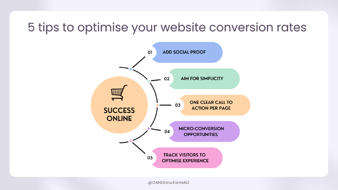
Here are five top tips to help you optimise your website conversion rates
Add social proof
We know that by adding social proof to your website that your conversion rate can improve. Users are looking to see if they can trust you. To add social proof:
Ask every customer or client to leave a review.
Include case studies, client profiles, or blog posts to position you as a genuine business making a difference, with happy clients.
Aim for simplicity
Your website might not be converting simply because there are too many possible options on your pages. To convert users follow the KISS principle - Keep it super simple:
Have properly positioned buttons. Users are used to seeing a shopping cart in the top right, contact details in the footer. The next step in the buying process should be obvious even to the most new-to-tech user.
Have a form? State clearly what information is needed, and have a thank you page or pop up which tells the user what will happen next.
Add filters to help users navigate choices when shopping.
We are lazy readers so use bullet points, bold words, short sentences.
One Call to Action per Page
You want visitors to your site to look at a page and have their eyes immediately drawn to the action you want them to take because when you give them too many options, buttons, menus, they experience analysis paralysis – they become overwhelmed and don’t make any choices at all.
Limit to one clear call to action per page, if you need more, ensure there is a flow through from top to bottom in terms of where users should click next.
In the case where there are multiple choices eg. Event dates, there is still a single Call to Action – choose a date. Make sure it is placed in an area that could be considered the ‘action’ part of a page.
It’s tempting to put multiple calls to action on a page in the hopes that the user will just click one of them, but this rarely comes to fruition.
Create micro-conversion opportunities
Micro-conversions are actions that don’t bring in money, they move a user closer to making the decision to purchase from you (the macro-conversion). Micro-conversions are sign-ups, downloads, newsletter subscriptions etc.
People are less likely to give away their email address these days, so unless you are offering something in return – eg. Sign up discount, special offers, VIP news. Here are three ways you could ask a user for their email:
Popups – strategically placed on your site, they can be timed for when users enter, move to leave, or reach a specific page.
Gated content – given out once a user subscribes to your newsletter, a great way to offer value and exclusive content.
Subscription blocks – integrated into the content of the page, often repetitive, just don’t overdo it.
You could try a combination of all three, as users journey through your website. As with all marketing it takes time to trial and test each option.
Track your visitor’s behaviour
The best way to track users’ behaviour is through using Google Analytics. You can set custom reports based on your goals. This is an easy way to see which pages/content users are engaging with and to look for patterns.
For example you may have a specific sales page, but no one clicks to convert – this shows that users are interested in what you are offering, but cannot find the information they need – perhaps it is caused by poor user experience or a lack of the information they need.
By carefully tracking your users behaviour you can see what they were looking for and where they dropped off (did not get what they needed to convert).
Want to talk about how your website is converting, then contact Kath today.